 Skip to content
✨ New Year Offer: Up to 20% off ·
Begin 2026 with something handmade ✨
✨ New Year Offer: Up to 20% off ·
Begin 2026 with something handmade ✨

The Art of Color — Expressing Emotions Through Color
Painting is a visual language built on imagination. At its core, it transforms inner emotions into visible forms. Among all the elements in art, color holds a unique power—it carries an unspoken “attitude,” a visible emotion, a direct reflection of the mind’s inner landscape.
Color is more than a visual tool.
It is emotion made visible.
🌟 About Color
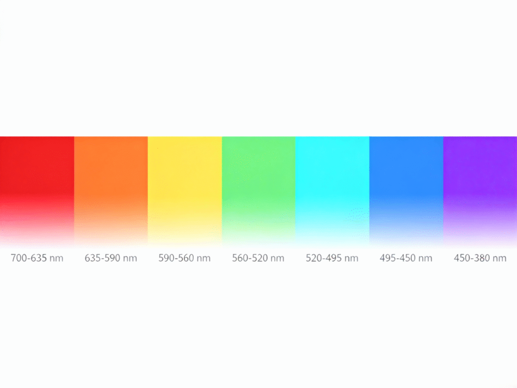
Color is a visual phenomenon, created when the human eye and brain interpret different wavelengths of light. Each color corresponds to a different wavelength, which is why every color carries a distinct visual and emotional impact.
🎭 Color & Emotion
Color has emotional power.
Different hues evoke different psychological reactions, influencing mood, energy levels, and even creativity.
Color is one of the most sensitive and expressive elements in visual art because it directly affects how we feel.
What Is Emotion?
Emotion refers to a person’s subjective response to external events—shaped by needs, desires, memories, and perception.
How Colors Communicate Emotion
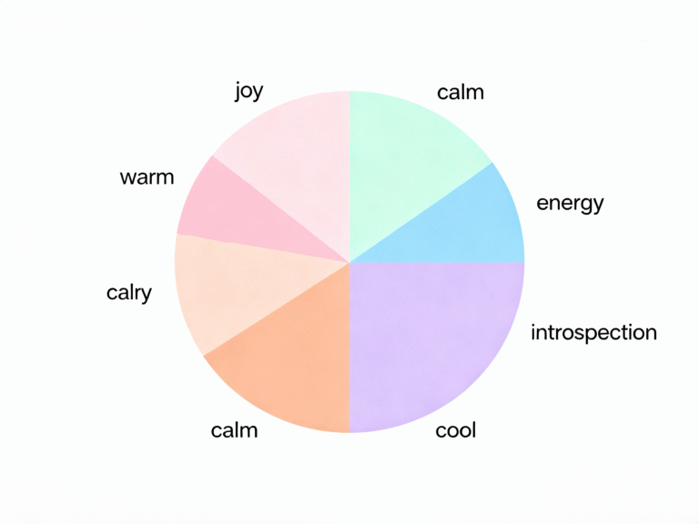
🎨 1. Value (Lightness & Darkness)
Bright colors (light yellow, pink, sky blue): uplifting, energetic, joyful
Dark colors (navy, forest green, deep purple): introspective, calm, sometimes melancholic
Muted/grayish tones: quiet, calm, rational, or distant
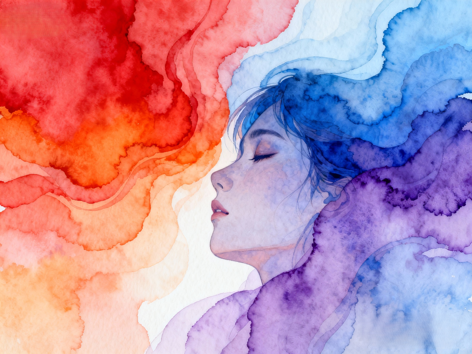
🔥 2. Color Temperature (Warm & Cool)
Warm colors (red, orange, yellow): passion, excitement, movement, sometimes anxiety
Cool colors (blue, green, violet): peace, logic, serenity, or sadness
💛 Why Emotional Color Matters
Using color to express emotion allows artists—and anyone communicating visually—to:
Show feelings more directly
Strengthen the emotional impact of their work
Express ideas more freely and intuitively
Create artwork that resonates deeply with viewers
Color becomes a language—one that speaks directly to the heart.
🖼 Color & Composition in Art
Both emotion and color are essential elements in visual storytelling. While beginners often focus on realistic representation, experienced artists know how to weave emotion into color choices.
Artists choose colors based on:
the theme of the work
the emotion they want to convey
the intensity of the feeling
the contrast or harmony needed for the message
Color Intensity & Emotional Impact
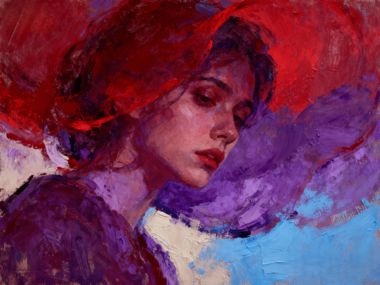
Bright, saturated colors = strong emotions (love, joy, anger, grief)
Soft, desaturated colors = subtle, quiet, introspective feelings
For complex emotions, artists often use multiple colors in contrast or harmony, creating layered emotional depth that helps the viewer experience the artwork on multiple levels.

I’m really enjoying the design and layout of your blog. It’s a very easy on the eyes which makes it much more enjoyable for me to come here and visit more often. Did you hire out a developer to create your theme? Outstanding work!
I love your blog.. very nice colors & theme. Did you design this website yourself or did you hire someone to do it for you? Plz respond as I’m looking to construct my own blog and would like to find out where u got this from. cheers
Spot on with this write-up, I actually think this web site wants far more consideration. I’ll most likely be again to learn way more, thanks for that info.
Wonderful beat ! I wish to apprentice while you amend your website, how can i subscribe for a blog website? The account helped me a acceptable deal. I had been tiny bit acquainted of this your broadcast provided bright clear idea