 Skip to content
✨ New Year Offer: Up to 20% off ·
Begin 2026 with something handmade ✨
✨ New Year Offer: Up to 20% off ·
Begin 2026 with something handmade ✨

Zodiac Jewelry: Read a Sign by Its Side of the Wheel | TibetanTwist

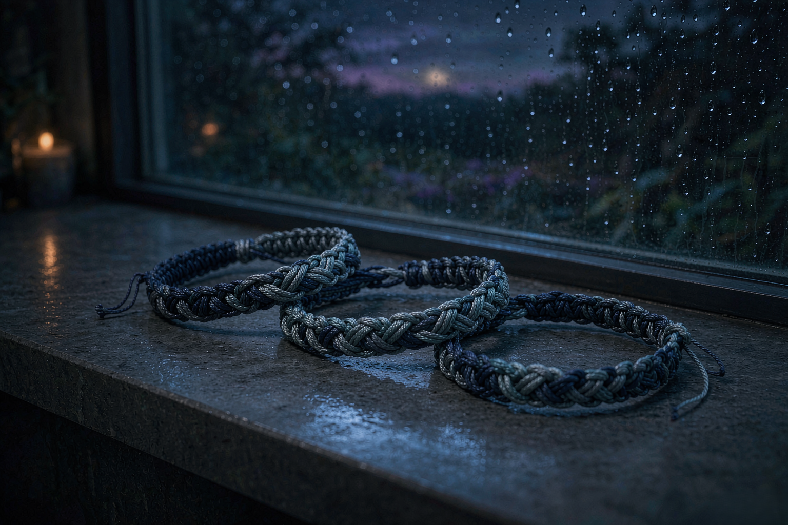
Some colors only make sense in company. A pine green looks flat until a lichen grey sits beside it; a midnight blue looks cold until a thin line of silver runs along the edge. I learned this at the worktable, not in a color theory book — one cord alone on the bench is a swatch, and two cords side by side are a decision. That is also the best way I know to read zodiac jewelry: not sign by sign, but by the neighbors a sign keeps.
Zodiac Jewelry Is a Conversation Between Neighbours
Most guides to zodiac color take one sign at a time. Aries gets red, Taurus gets green, and twelve entries get printed under twelve headings. The trouble is that nobody wears a color in an empty room. A wrist sits under a cuff, next to a coat, beside a face; the cord you tie on Friday has to talk to the sweater you pull on Saturday.
The zodiac wheel is arranged as a continuous ring for a reason. Each sign sits between two others, and those two are its nearest relatives — not its closest friends, necessarily, but the ones it stands beside all year. Cancer leans on Gemini and Leo. Libra has Virgo on one side and Scorpio on the other. When you read a sign’s color as a conversation with its neighbors, the palette stops being a label and becomes a composition with a warm edge and a cool edge, a thread that pulls forward and one that recedes.
That shift matters most in handwoven jewelry, where color is the entire structure. There is no metal setting to separate one hue from another — the knots sit directly against each other, and the eye reads the transition. So the question at the worktable is never just which green, but which green, holding hands with which grey.
The Warm Edge and the Cool Edge
Take Cancer, a water sign that carries the whole summer on its shoulders. On its own, the comfortable reading is pale blue and shell white — sea colors, quiet and slightly greyed. That is a fine bracelet and an easy one to like. But look one step to either side of it: Gemini on the leading edge brings citrine yellow, a sunlit, faintly acidic yellow that reads as evening light on a wall; Leo on the trailing edge brings orange and gold, the deep amber a kitchen holds at seven o’clock in July.
Suddenly the same sign has a warm edge and a cool edge. A cool-edged Cancer piece stays in the sea — light blue, shell, the faint green of shallow water over sand. A warm-edged one picks up a single marigold strand at the closure and lets the pale blue carry it. Both are Cancer. They simply address different rooms, and different skin.
This is the practical gift of the neighbor method. You are no longer choosing between twelve fixed palettes. You are choosing a direction — toward the fire at one end of your section of the wheel, or toward the air at the other. For Virgo, that means leaning toward the cream-and-purple of a neighbor or toward the pink-and-blue breeze at the other shoulder. For Capricorn, it is deep brown and forest green at the center, with blue-grey available if you want to drift toward water.
Every piece below already exists as a finished bracelet on our shelf. You pick from what is made, not from a worksheet — nothing is knotted to a brief. No two come out alike, because each one is made by hand, one at a time.
Reading the Wheel at the Worktable
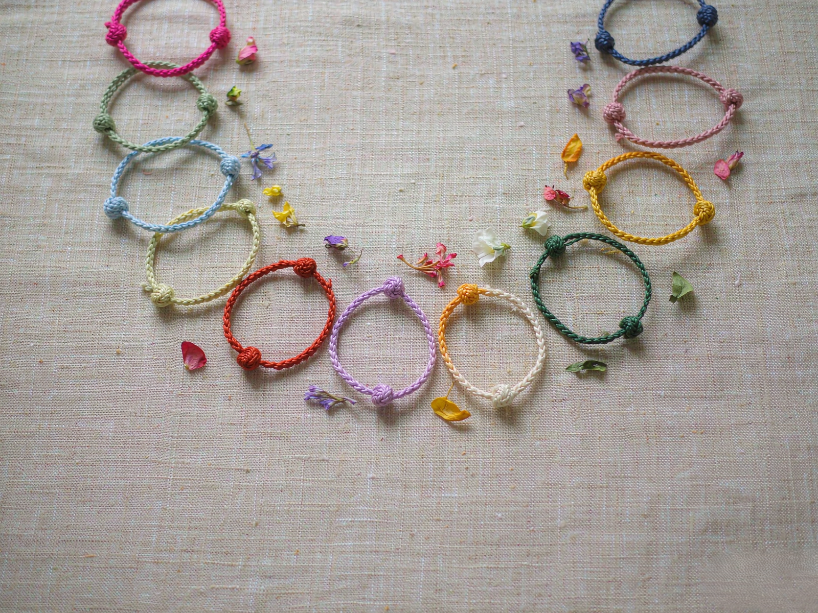
Twelve cords in a row is exactly how our color drawer looks. When I match a palette for a sign, I do not start with the sign’s own color. I start with the two beside it, and I hold all three together under the window. If the middle cord disappears, the palette is too polite. If it shouts, the neighbors are not doing their job.
Here is what that process actually looks like for a single palette, the deep blue and gold of Sagittarius. The blue comes first, the color of a lake’s far shore in late afternoon. Then the neighbor check: Scorpio on one side suggests indigo and deep purple — they can share a blue, so the blue is allowed to be dark. Capricorn on the other side offers brown and green, which is where the gold comes from, and why the piece reads warm rather than nocturnal. The finished bracelet is one hue with a lit seam running through it, and it photographs almost the same at noon and at dusk.
Not every palette is that cooperative. Some signs resist their neighbors: an air sign may want a crisp acidic hue while both neighbors are gathering muted earth tones. When that happens I keep the chord the sign asks for and let the neighbors show up in the small parts — the knot at the closure, the two strands at the sliding end. A little goes a long way when the color is at a joint rather than down the middle.
Which One Is Yours
The quickest way to use all of this is to answer two questions instead of one.
First: what is your sign, and which edge of it interests you — the warmer neighbor or the cooler one? A Leo who wants to be less loud can lean toward the pale blue on its water side; an Aquarius who wants more warmth can drift toward the cream and gold at the seam. Second: what color is already on your wrist every day? Look at your coat cuffs, your watch strap, the sweater you reach for on a tired morning. A zodiac piece that agrees with one of those gets worn far more than one that has to be planned around.
If you are buying for someone else, the neighbor method is a quiet advantage. You do not need to know their birth chart; you need to know one color they wear and one they avoid, then pick the edge of their sign that leans toward what they already love.
To see the finished palettes side by side, start with our handwoven zodiac bracelets and the full Zodiac & Astrology journal. If a single hue is what you are after, the deep blue and gold adventure bracelet is the one that reads best from morning to evening, while the pink-and-blue breeze bracelet is the quietest of the pairs and sits easily against denim. For something with a warmer seam, the cream-and-purple earth bracelet is the one I keep putting on the windowsill.
Color is not a code to decode. It is a conversation you get to keep having — with the light in the room, with the sleeve you choose, with the two signs standing quietly on either side of yours.
Nature, woven by hand. Color, woven into stories.
Want the next studio note on color and cord? Join our letter — one short email when a new palette leaves the worktable.
