 Skip to content
✨ New Year Offer: Up to 20% off ·
Begin 2026 with something handmade ✨
✨ New Year Offer: Up to 20% off ·
Begin 2026 with something handmade ✨

Botanical Jewelry: Lessons From an Autumn Windowsill | TibetanTwist


Botanical Jewelry: What the Autumn Windowsill Teaches | TibetanTwist
In October our studio windowsill becomes a small museum. Three physalis husks, dry as paper. One maple leaf that went rust red overnight. A bundle of wheat someone left there in August and never took back. And below all of it, a handwoven bracelet in ochre, rust and a tough little green that refuses to be autumn.
We keep the sill cluttered on purpose. Botanical jewelry is not designed on a screen; it is read off real stems, real husks and the way light lands on them the week the season turns. Here is what that sill has taught us about color, structure and choosing a piece for the cold half of the year.
The Season Turns in a Windowsill, Not a Calendar
Autumn does not arrive on a date. It arrives in objects — usually on somebody’s windowsill, three at a time.
First the husks. A physalis lantern dries from clear orange to a translucent shell, and as it dries, its color deepens instead of fading. That is the odd, useful thing about autumn material: it concentrates. Pick a maple leaf in mid-September and it is a soft middle red; leave it on the sill for ten days and it lands somewhere between rust, oxblood and brick.
Second the stems. Wheat, oats, seed heads, all turning from gold to straw. They are our best swatch for the quiet neutrals — cream, oatmeal, bone — and they are not boring, provided something next to them has weight.
Third, the greens that refuse. On every autumn sill there is one sprig that stays green: spruce, moss, a stubborn ivy leaf. It is the reason an autumn palette does not turn into brown soup.
We photograph the sill every few days through October. Twelve small images, same corner, same light. That set is what we draw from when we plan a botanical palette for the next season. Not mood boards, not trend reports. A sill.
Why Three Colors Are Enough for Botanical Jewelry
Look again at that sill photograph and count the colors honestly. Rust. Ochre. One green. Everything else is light.
That restraint is the whole lesson of botanical-inspired design. A stem does not wear eight colors; it wears one, plus a shadow, plus whatever light is doing that hour. A garden seems abundant because many simple palettes are standing next to each other, not because any single plant is complicated.
So when we plan a piece, three is the number we work with. One color that carries the season. One color that keeps it from falling flat. One quiet neutral to hold the two apart.
An autumn pairing we return to every year: rust red as the carrier, pine green as the counterweight, oatmeal cream as the quiet neutral between them. Rust alone reads heavy. Rust beside cream reads warm. Rust beside cream and a single line of green reads alive.
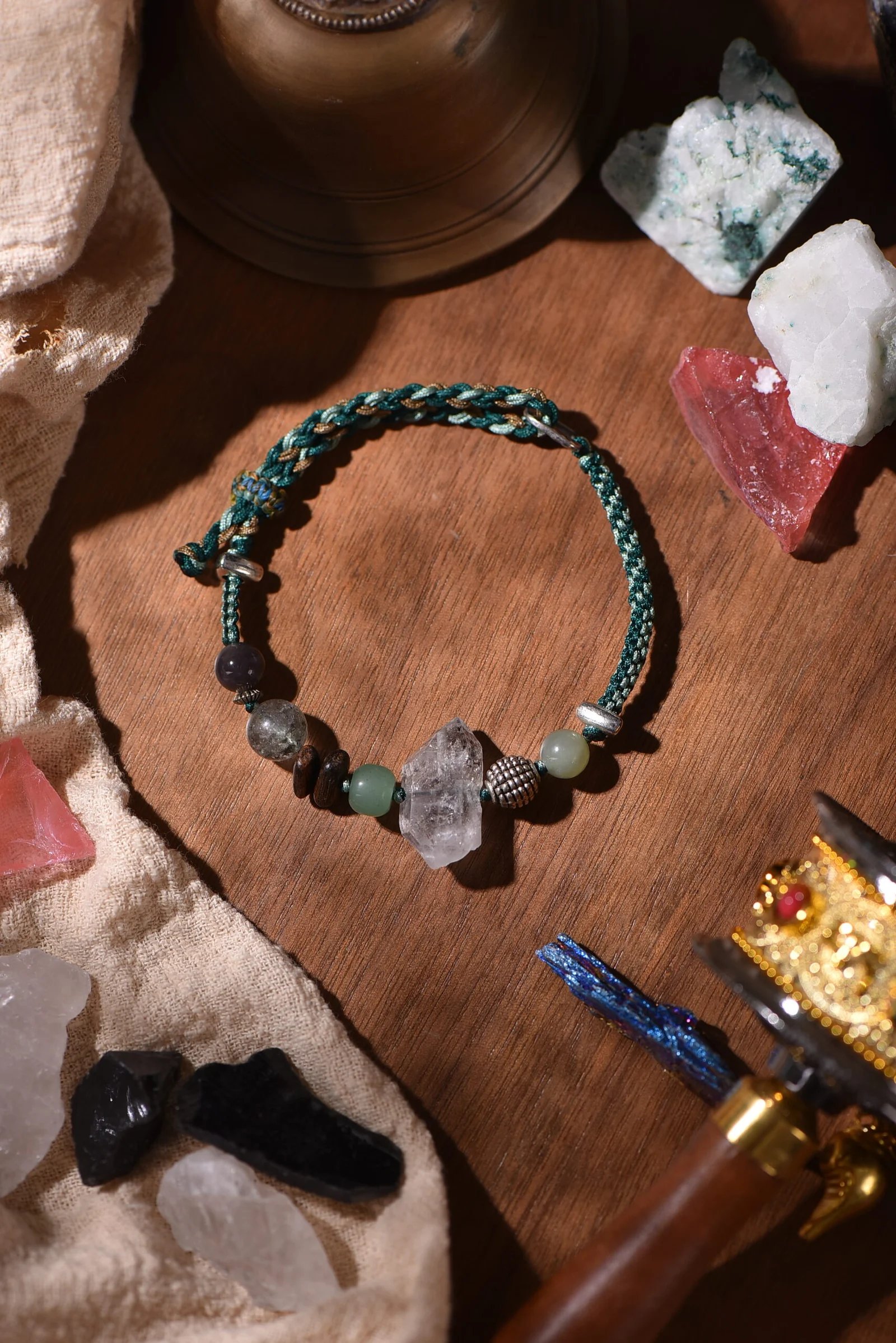
We also knot a softer version of the same idea — deep green crossed with a warm earth brown, no red at all. It works in a different register: less seasonal, more like the underside of a hedge. And because we mix the cord by hand, the two colors never meet the same way twice. Where rust hands over to cream, the stitch is a little tighter or a little looser. It looks like a knot that changed its mind, which is exactly what a real leaf edge does.
Brown Is Not One Color — A Studio Guide
Most people say brown and mean one thing. We keep six on the shelf and think of them as completely different characters.
Terracotta is warm and slightly chalky, the color of a plant pot left out through summer. It flatters skin with olive or gold in it.
Ochre is brighter and more yellow — wheat, turmeric, a field at four in the afternoon. It is the color that makes an autumn palette feel sunlit rather than smoky.
Sienna sits between terracotta and ochre, with more red in it. It is the color of a brick wall after rain.
Umber is cooler and duller, the color of soil under a stone. It is a stabilizer, not a star.
Oxblood is deep enough to read almost black in low light, then warm when it catches sun. Tibetan textiles taught us to trust such colors, and we keep coming back to them when a piece needs gravity.
Straw is not really brown at all — it is a pale gold with the saturation pulled out. We use it the way a florist uses filler: to give the bolder stems somewhere to stand.
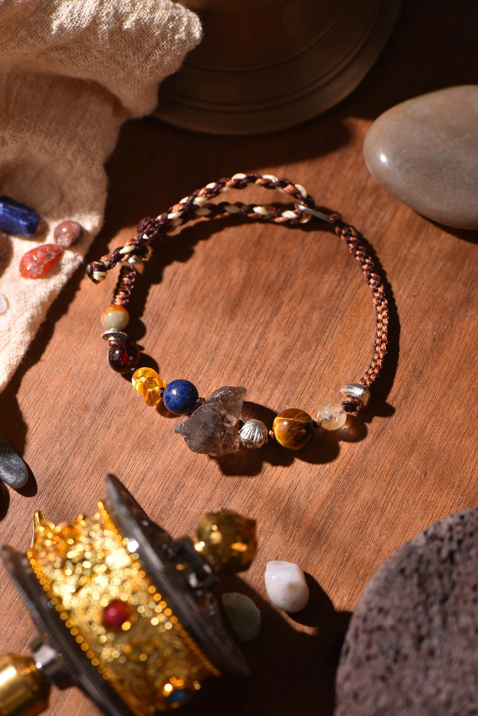
Because a handwoven bracelet sits against skin all day, the brown you choose is really a skin decision. Cool umber tends to disappear on cool skin; warm terracotta and ochre tend to lift it. Warm skin usually wears straw and umber beautifully — the bracelet reads as part of the arm rather than something resting on it. Try the piece on your forearm, not your wrist bone. Turn to the window. That is the whole test.
How to Wear Botanical Jewelry in October
Three small habits from the studio, for the weeks when the light gets low.
Let texture do the work of color. Autumn closets are mostly knitted, brushed and matte. A waxed-cord bracelet is smooth and slightly shiny, so it sharpens a wool sleeve instead of blurring into it. One brown cuff on a brown jumper looks deliberate only when the finishes disagree.
Stack high, not wide. Two thin woven strands in two different browns beat one thick band; the eye reads the gap between them as texture. If you add a third, make it the green.
Move color lower. Autumn is when we reach for scarves, and a scarf at the neck can carry saffron, oxblood or moss while the wrist keeps only one echo of it. Pick the wrist color from the last fifty centimeters of the scarf — that is where the dye is usually deepest.
For a first autumn piece we usually suggest something with no more than two hues, in a cool or a warm register, but not both. Our pine-green and bark-brown woven bracelet and our terracotta, cream and earth-brown woven bracelet are the two we reach for most in this weather. If you want a single hue that does all the work on its own, the deep-brown and forest-green piece reads as one color from across a room and as three up close.
Everything is made by hand, one at a time, at our bench — so no two pieces carry quite the same handover between colors. You are choosing from our existing collections, which is exactly how we prefer it: nothing is promised before it exists.
See the full range in our botanical journal. If this season has you reaching for brown, start there — and tell us which husk, leaf or stem on your own windowsill decided it for you at hello@tibetantwist.com.
Nature, woven by hand. Color, woven into stories.
Want more like this? Join the TibetanTwist letter — one botanical palette and one studio story in your inbox each week, no noise. Subscribe here.
