 Skip to content
✨ New Year Offer: Up to 20% off ·
Begin 2026 with something handmade ✨
✨ New Year Offer: Up to 20% off ·
Begin 2026 with something handmade ✨

What the Garden Looks Like at Dusk: Botanical-Inspired Jewelry in Muted Color | TibetanTwist

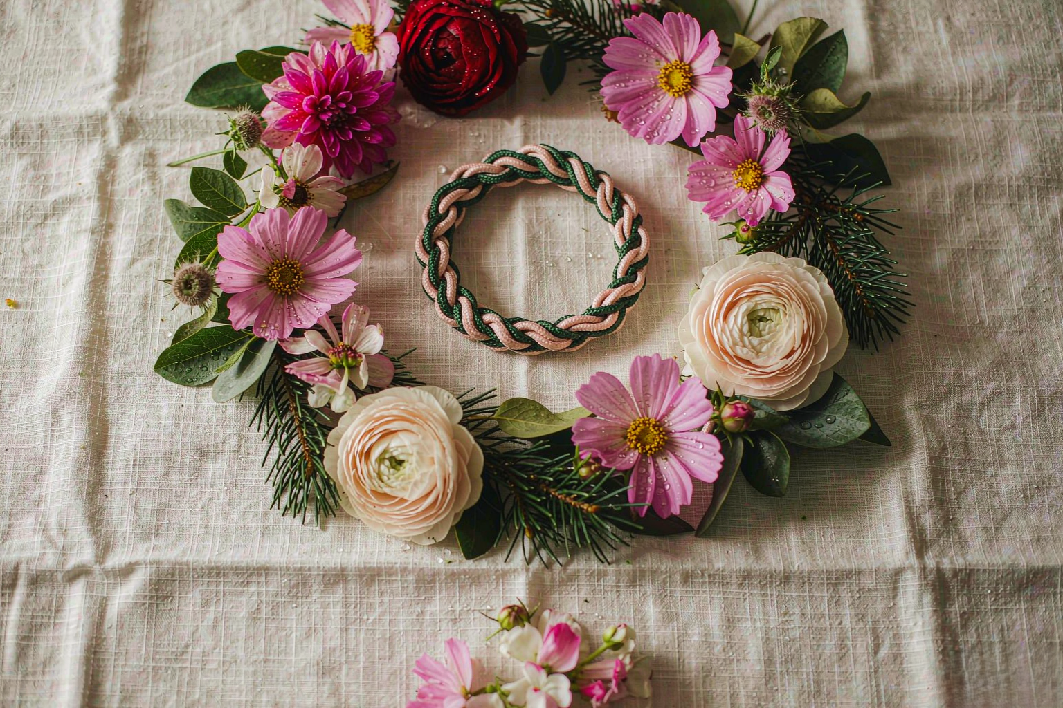
At six in the evening the garden stops performing. Peonies that were bright at noon go soft, almost bruised. Pine green deepens until it is nearly black in the shade and copper where the last light lands. A white flower turns the color of old paper. Nothing has changed except the light, and the whole palette has moved.
We build our palettes in that hour. Botanical-inspired jewelry that only looks right in daylight is a piece you wear half the time. So the colors we choose have to survive the low light — a kitchen at night, a lamp on a table, the blue-gray after the sun goes.
Why Dusk Changes Every Color
Dusk is not just dimmer daylight. It is daylight with the warm part removed. As the sun drops, the light loses its gold and keeps its blue, and our eyes quietly adjust how they read everything in front of them.
The painters knew this before anyone could measure it. A peony pink that seems saturated at noon looks chalky at seven. A pure white reads as a pale lilac-gray. A saturated green loses its bite and slides toward charcoal. It is not an optical trick. It is the actual color of the thing, seen by a different eye.
This matters for jewelry more than for almost anything else we make, because jewelry is worn against skin, indoors, mostly in the evening. The bracelet you chose in a bright shop window at ten in the morning may meet you at dinner looking tired.
So at the bench we ask a different question. Not: is this color beautiful? But: does this color still hold at nine at night, under a bulb, next to a wrist?
Peony Pink and Pine Green, Read After Sunset
Most of our botanical palettes come down to a warm note and a green one, and both behave strangely after sunset.
Peony pink is the harder of the two. Pale pinks lose their color first; they fade toward beige and can look dusty against evening light. What survives is the pink with a little more depth behind it — the shade you see in the folded center of the flower, not the outer petal. So when we match cord to peony, we match the inside of the petal, the part that holds a small amount of red-brown. On skin at night, that reads as warm rather than washed out.
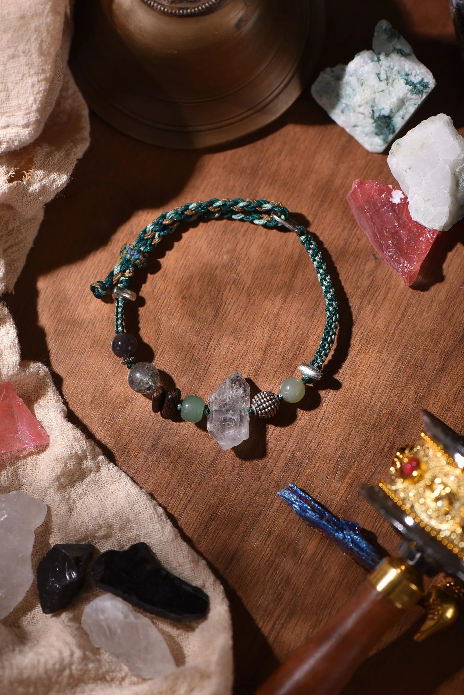
Pine green is the easier one, but it has a tendency: too much yellow and it turns olive under a lamp, too little and it turns gray. The greens we return to sit in the middle, with a hint of blue in them, the color of the underside of the needle rather than the tip. That blue thread is what keeps the green alive when the room is lit by one warm bulb.
Together they do something the single colors cannot. Peony pink and pine green set side by side give each other depth; the green makes the pink look intentional instead of sweet, the pink keeps the green from going flat. Our hands have woven this pairing more times than any other — into a handwoven bracelet in pine green and bark brown, into a two-tone infinity knot in oxblood and cream. Two notes, one long conversation.
Reading a Flower the Way a Printer Would
There is a simple ritual in our studio. We bring one flower to the bench, lay its petals on a sheet of white paper, and describe each in three words: what it is, where it was found, and what sits underneath.
The third word is the useful one. Every petal has a second color hiding under the first, and that second color is what survives dusk.
Look at the base of a cornflower and you find violet. Hold a peony petal up to a lamp and the blush turns faintly apricot. Scrape the edge of a marigold and there is brown in the orange. That undercolor is what we reach for when we choose thread, because it does not vanish when the light does. It is the note that stays.
We keep a small book of these readings — a page for each flower, the color on top, the color underneath, the season it appeared. Nothing is invented. Everything is looked at. When someone asks us why a certain pink reads warm rather than pastel, the honest answer is that we matched the back of the petal and not the front.

The Colors We Choose for Evening
If you are building a wearable palette, evening is a fair test — and a few rules come out of it.
Choose muted over bright. A dusty rose, a grey-green, a slate blue, a wine brown. These look considered in daylight and do not collapse at night, because they never depended on brightness in the first place.
Choose one deep anchor. A single dark note in the piece — oxblood, deep brown, near-black green — gives the whole weave a center, and the lighter colors read as choices around it rather than as fading.
Choose a color that has no name of its own. The most reliable botanical hues are the ones without a word: the green of a leaf’s underside, the pink of a petal just before it drops, the brown of a stem gone woody. Colors with dedicated names tend to be a little too decided.
Choose against your own skin. Wear it at the hour you will actually wear it — an evening, a low lamp, hands on a table. Then decide.
How to Wear a Dusk Palette
The palette we are describing is easy to wear because it does not ask for attention.
With dark clothes, let the muted note lead. A grey-green woven bracelet against a navy sleeve reads as a small piece of the garden carried indoors — a warm edge, no color shouting.
With white, add one deeper hue. White linen at dusk flattens everything near it. A wine-brown or pine-green piece brings the contrast back without turning the outfit into an event.
With other jewelry, keep it grounded. Handwoven cord looks best next to something old: a plain ring, a thin chain, a watch with a leather strap. The weave has visible texture, so let it be the texture that gets noticed.
At night, choose one piece and wear it every day. Muted colors reward repetition. A bracelet worn for months takes on the light of your routine, and the color settles into what the piece becomes.
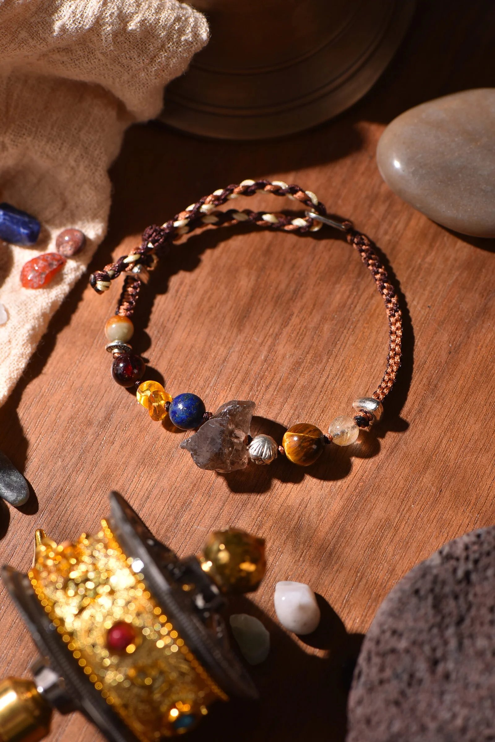
When you are ready to look, start where the muted palette is carried furthest — our handwoven bracelet in terracotta, cream and earth brown, whose tones deepen rather than fade after sundown, or the openable keepsake pendant, where the woven outside frames a small space you fill yourself. The full range of color stories sits in our color stories collection. Every piece is made by hand, one at a time, and no two are alike.
Dusk is not the end of the garden’s color. It is the version of it that gets to come inside with you.
Nature, woven by hand. Color, woven into stories.
If you like looking at color this way, subscribe to our newsletter — one letter a week on palettes, knots, and the hours when light changes its mind.
