 Skip to content
✨ New Year Offer: Up to 20% off ·
Begin 2026 with something handmade ✨
✨ New Year Offer: Up to 20% off ·
Begin 2026 with something handmade ✨

Tibetan-Inspired Jewelry: Dye Vat to Knot | TibetanTwist


A spoonful of root powder goes into warm water. The water turns the color of brick dust, then of dried blood, then of something older than either word. Nothing happens for a while. You stir. You wait. You lift a length of cotton out and watch it breathe in the color, and only then does it look like the red you have been wearing on your wrist all along — except yours arrived in a box, already finished, and this one is still deciding what it will be.
That is the distance our Tibetan-inspired jewelry tries to close. Not the distance between a marketplace and a mountain pass, but the distance between a batch of fiber and the finished thread. Before anything can be knotted, something has to be dyed.
Color is made, not chosen
A paint chip gets picked in a second. A dyed thread gets made in an afternoon, and it does not always come out the way you planned.
The old vats on the plateau worked the same way. Madder root went in for the reds — a red that leans brown at first and only sharpens after two or three dips. Indigo went in for the blues, and indigo is the slowest of all: each pull out of the vat adds one thin layer of blue, so a deep lake blue is really twelve small decisions and not one big one. Saffron and its lookalikes gave the yellows, the ones that read like barley in late August. Walnut husk and iron-rich mud gave the browns and near-blacks, the quiet colors that hold the loud ones up.
Nothing about that process is instant. The vat has to be warm. The fiber has to be wet all the way through before it touches the dye, or the color sits on the surface and rubs off on a sleeve within a week. The dyer judges by hand and by smell, not by number.
We think about this every time we open a spool from a modern supplier. The chemistry is friendlier now — no one is measuring lye by eye in our studio — but the logic has not changed. A color that was made in stages has depth, because every stage left something behind.
The plate: how the plateau stacked its brights
Walk into a plateau house and look at what is actually on the loom. Not the scarves on the tourist rack — the working textiles. Aprons, door valances, saddle blankets, the panels tied onto animal harnesses.
What you see is rarely one color running the whole length. You see a plate: two or three brights separated by narrow bands of something almost neutral, then a sudden run of one color that goes on far longer than you expect. The brights sit against undyed wool, against felted gray, against a brown that has been in the sun for years. The brown is not a background. It is a divider, and it is doing most of the work.
That is the second lesson. Strong colors do not need more strong colors around them. They need something that keeps them from blending into one another.
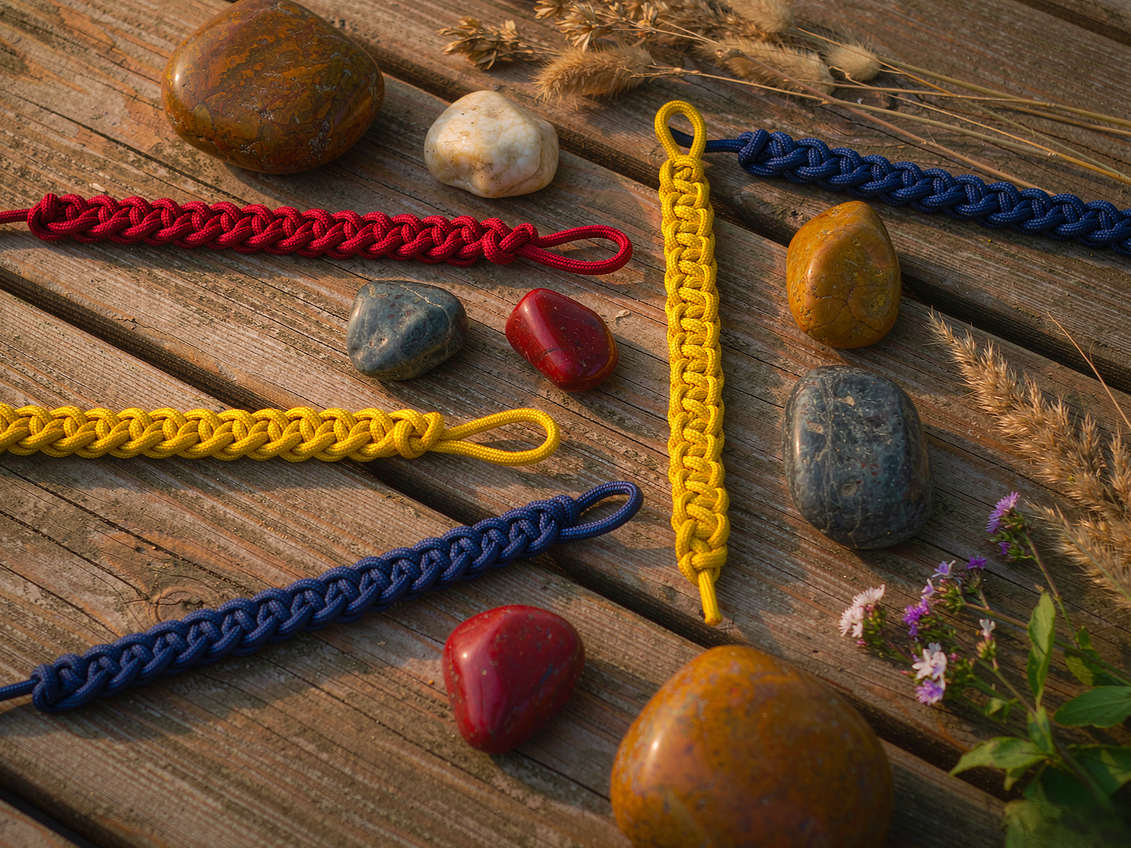
We borrow that structure directly. A three-color bracket may run oxblood, saffron and indigo, with a thin line of straw-colored cord between the second and third — that line is the felted gray of the loom, translated into wax. Take it out and the bracket goes soft. Leave it in and each bright stays separate enough to be read from three steps away.
Look closely at a flat braid on a wooden table and you can count the plate rather than guess at it. Count the bands, not the colors. Two wide, one narrow, one long run — that is the grammar.
What survives the translation to cord
A dye vat and a waxed cord are not friends. One is wet, open, absorbent fiber. The other is a sealed, twisted, water-resistant thread that has been pulled through wax to keep it from fraying.
So we translate instead of copy. Four things carry over well; two do not.
What carries over: the order of the stack (darkest at the edges, brights in the middle, so the eye starts at the boundary and moves into the middle); the width of each band (a narrow band reads as a punctuation mark, a wide band reads as a sentence); the temperature of the light (plateau color was chosen for thin air and hard glare, so we keep hues slightly deeper than the reference flower); and the pause (a length of plain cord between two brights, left deliberately unbraided, so the wrist has somewhere to rest).
What does not carry over: the matte finish of raw wool, and the slow fade of natural dye. A waxed cord holds its tone longer and shines a little more than a felted apron ever would. We do not try to fake the fade with a wash. Instead we let the cord darken on its own where it bends, which is a different kind of record and a more honest one.
The knot matters here too. Every crossing in a flat braid pinches the thread, and a pinched thread catches light differently than a straight run. This is why our brightest pieces are braided rather than beaded — the braid breaks up a solid color into dozens of small tilted surfaces, which is exactly what the plateau achieved with fringe and fold.
How to wear a dyed palette without looking costumed
The pieces above are strong, so the styling around them should be quiet. Three habits we use on our own wrists:
One plate, one wrist. If a bracelet carries three colors, the other wrist stays bare, or holds a single-color cord. Two plates at once read as a costume rather than a choice.
Let the sleeve do the dividing. A cream linen cuff, a faded denim edge, an undyed wool sleeve — any of these acts like the felted gray on the loom. They give the brights a divider, and the brights get louder without getting bigger.
Match the temperature, not the exact hue. If your piece runs warm — oxblood, saffron, straw — a warm ochre or rust in your clothing will agree with it. If it runs cool — indigo, teal, a cold green — reach for denim, slate, or a washed blue-gray. Trying to match a bright exactly always looks like an accident.
Wear it against skin, at least once a week. Waxed cord takes on a small amount of warmth and oil and softens at the ends. The colors do not change, but the surface does, and the piece stops looking new in the best way.
If you are choosing your first one, pick the plate before you pick the bracelet. Decide which two or three colors you want living on your wrist for a year, then find the piece in our Tibetan Culture journal that already runs that arrangement. Nothing here is built to a brief — every piece comes off the same bench as its neighbours, and no two are quite alike.
Three places to start: a blue-and-white single strand when you want one cold band doing all the talking; a cream-and-terracotta strand when the divider is the point and you only want one bright; and a deeper blue-and-gold braid when indigo is your base color. If you would rather see the whole range side by side, the bracelet collection is where we keep them.
What the vat still teaches
We are not dyers. We buy our cord already colored, and we say so plainly. But we keep the vat in mind, because it explains something a paint chip cannot: a color with layers in it stays interesting in year three, and a color poured in one pass goes flat by month six.
That is the whole argument for handwoven over molded. The structure gives the color somewhere to live — a bend here, a shadow there, a place where a knot pulls the light sideways. The vat starts the story. The hands finish it.
Nature, woven by hand. Color, woven into stories.
If you want the next one in your inbox before it goes anywhere else — the new palettes, the studio notes, the pieces that came out one shade off and got kept anyway — join our letter below. We only send when there is something worth holding.
