 Skip to content
✨ New Year Offer: Up to 20% off ·
Begin 2026 with something handmade ✨
✨ New Year Offer: Up to 20% off ·
Begin 2026 with something handmade ✨

Prayer Flags and Palettes: The Colors Behind Tibetan-Inspired Jewelry — TibetanTwist

Prayer Flags and Palettes: The Colors Behind Tibetan-Inspired Jewelry — TibetanTwist
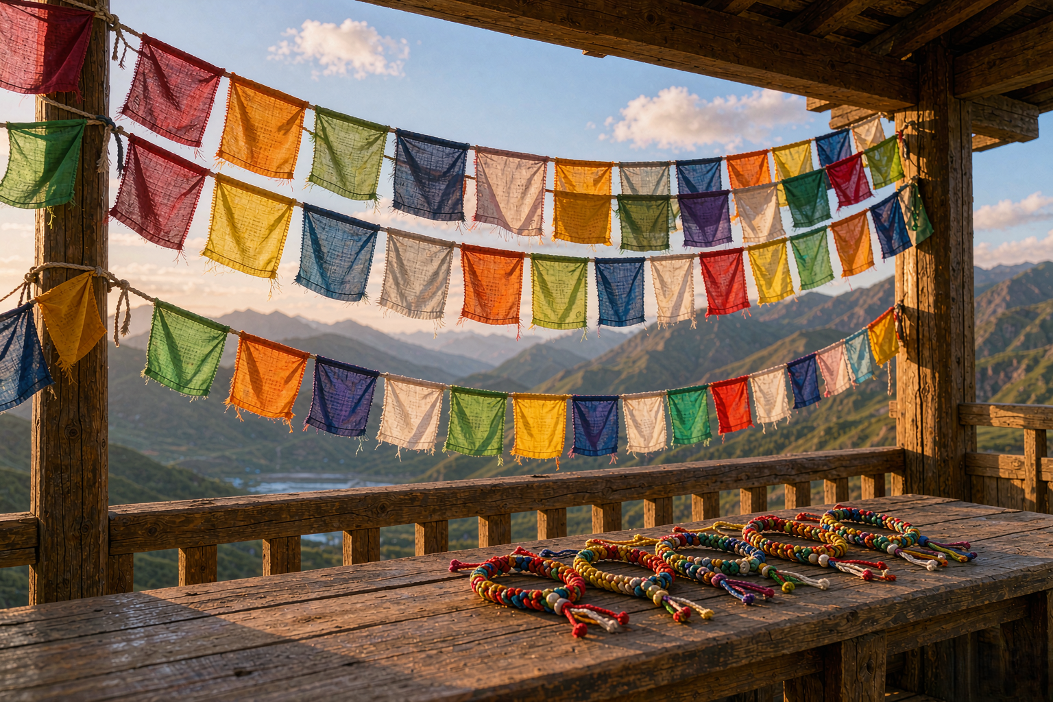
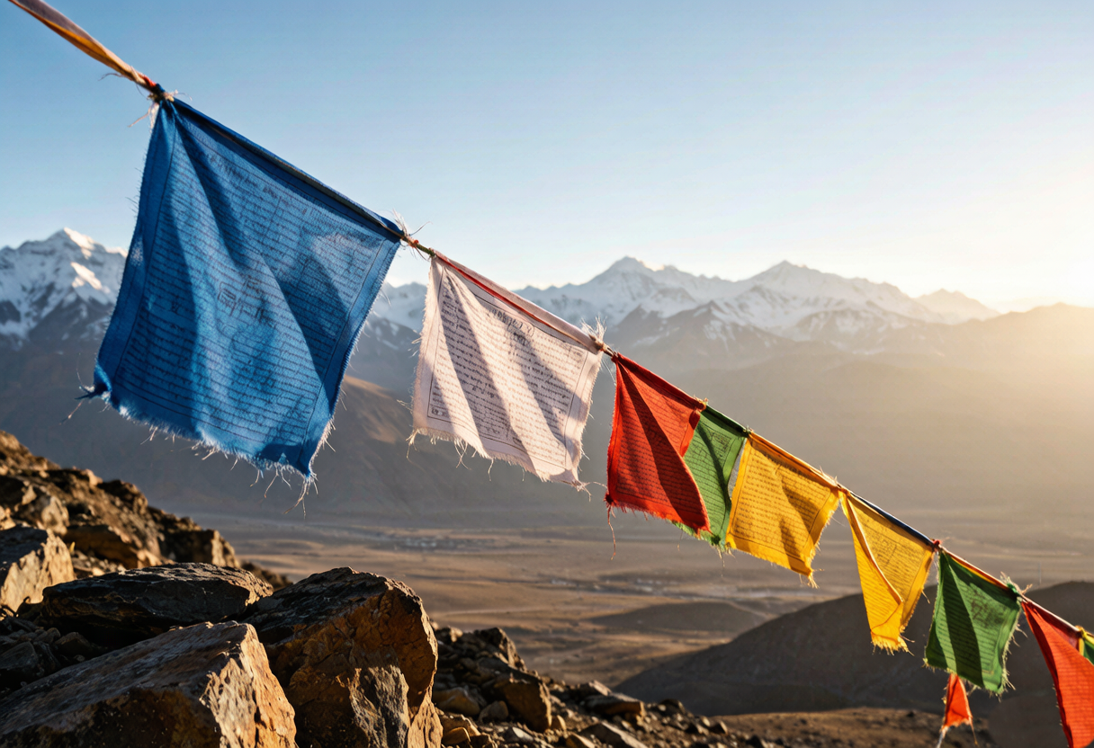
The first time I saw prayer flags fluttering against a high-altitude sky, I noticed the color before anything else. Blue, white, red, green, yellow — each strip of cotton faded by sun and wind, repeating in a rhythm that looked almost like a knot pattern. That rhythm is what we reach for when we design Tibetan-inspired jewelry: not a symbol copied, but a palette lived in.
At TibetanTwist, our handwoven pieces begin with what we see outdoors. The plateau taught us that color can be bold without being loud, and that a small cord bracelet can carry the same visual weight as a landscape. This is the story of how prayer flags became a color notebook for our studio, and how their sequence of hues still guides the way we pair threads today.
We are not trying to reproduce a place. We are trying to remember it accurately enough that someone wearing the piece can feel the same dry air and late light. That is the difference between copying a look and borrowing a palette.
What Prayer Flags Taught Us About Wearing Color
Prayer flags are arranged in a fixed order, yet no two valleys hang them the same way. The wind fades them at different speeds, so the palette shifts from village to village. We took that lesson into our studio: color is never fixed. A red thread next to cream reads differently than a red thread next to charcoal. A saffron cord beside indigo looks electric; beside ochre, it looks warm.
For TibetanTwist, Tibetan-inspired jewelry is a study in these relationships. We look at how the plateau wears its pigments — clay walls, turquoise doors, maroon robes, golden barley — and translate those pairings into knots. The result is not costume or imitation. It is a handwoven piece that carries the same boldness: saturated color held in place by slow, intentional craft.
We avoid metaphysical labels. The flags do their own work; our work is to keep the color honest. When you wear a red-and-ochre handwoven bracelet, you are wearing the same decision a flag-maker made long ago: that certain colors belong together because the landscape said so. That is enough. The meaning is in the pairing, not in a claim.
A good palette also needs negative space. In our designs, cream and slate act the way sky acts between peaks. Without that pause, the bright threads would argue. With it, they sing.
From Plateau Pigments to Thread Palettes
The plateau is short on soft pastels. What it offers instead is range: oxblood red from dried berries, saffron from wildflower pollen, indigo from fermented leaves, slate grey from river stone, cream from sheep’s wool. These are not colors chosen from a screen. They are colors that have already survived sun, dust, and altitude.
Our Tibetan-inspired pieces start with these raw references. We dye waxed cord to match what we see — not perfectly, because perfect matching would erase the hand. We want the slight variation between one knot and the next, the way a flag fades more on the left side than the right. That unevenness is the evidence of a human hand, and it is what makes each piece one of a kind.
Color naming matters here. We do not use generic labels. A red becomes oxblood red. A blue becomes monsoon sky blue or deep indigo. A yellow becomes saffron or barley gold. The name is a map back to the source. When you read “oxblood red and saffron handwoven bracelet,” you should smell dry air and see dust catching late light.
The dye process itself is slow. We work in small batches, testing a strand against daylight before we commit a whole spool. Sometimes the first dip is too orange, the second too brown, the third just right. That third batch is the one that becomes a bracelet. The others wait on the shelf for a different design, because in handwoven jewelry, no color is ever wasted.
This is why we call our work nature-inspired jewelry. The colors are borrowed, not invented. The cord is waxed so the dye sits close to the surface and ages like a path that has been walked many times. After a season on your wrist, the piece looks less like something new and more like something that belongs to you. The color settles in.
Why Tibetan-Inspired Jewelry Feels Different on the Wrist
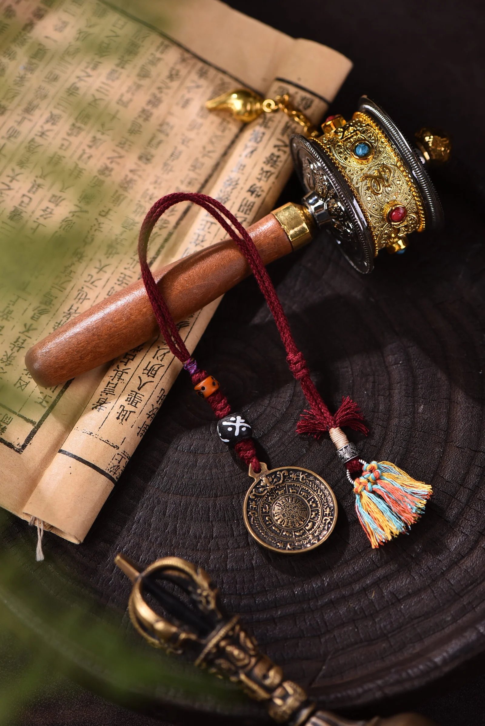
There is a weight to plateau color that comes from contrast, not heaviness. A single strand of deep indigo cord can hold its own against a pale linen shirt. A saffron-and-oxblood bracelet turns a simple cuff into a statement without shouting. The colors do the talking because the craft stays quiet.
Our knots are small, repeated, patient. Macramé bracelet techniques let us build texture that catches light the way prayer flags catch wind — not static, always slightly moving. Wax cord jewelry holds dye richly and ages gracefully. The cord darkens where it touches skin, softens where it bends. After a few weeks, the piece looks less like something you bought and more like something you grew into.
That is the difference between a print and a weave. A printed pattern sits on top. A woven pattern is the structure. In our Tibetan-inspired collection, the color is inside the knot, not pasted over it. Every time the cord crosses itself, the shade shifts a little. The eye reads it as depth, and the hand reads it as texture.
No two pieces are alike because no two hands pull a knot the same way. This is the slow-made promise: the time is visible. You can see it in the tension, in the way one cord sits slightly higher than its neighbor, in the small irregularities that a machine would smooth away. A customer once told us that her bracelet looked different every time the light changed. That is exactly the point.
We also pay attention to scale. A wide cuff can carry five colors at once, but a thin cord bracelet can only carry two or three before it starts to chatter. Knowing when to stop is part of the craft.
How to Style a Piece From the Plateau
Tibetan-inspired jewelry does not ask for a special occasion. It asks for plain clothes and good light. Start with one piece: a red-and-indigo handwoven bracelet against a white tee, or an earth-tone cord charm on a brown leather strap. Let the color be the pattern.
If you prefer layers, keep the metals minimal. Silver or brass work, but the cord should lead. Stack two pieces from the same palette — oxblood with saffron, indigo with slate grey — and leave a gap of skin between them so each knot line can breathe. Our pieces are made to be seen, not hidden.
These pieces travel well. The waxed cord resists water, and the knots hold their shape through daily wear. That means a Tibetan-inspired bracelet can go from a morning market to an evening walk without needing special attention. The color just keeps doing its job.
For a closer look at the collection, see our earth-tone handwoven charm built with yak bone and glass beads, or the brass-accented cord charm that carries the same palette into daily use. Browse the full bracelets collection to find the colorful handmade jewelry that matches your own palette.
Every color in our Tibetan-inspired jewelry began as a response to a real place. We did not invent the combinations. We followed the flags, the dust, the late-afternoon light, and knotted what we found.
Nature, woven by hand. Color, woven into stories.
Want new palettes in your inbox? Join our newsletter for studio notes, color stories, and first access to new drops.
