 Skip to content
✨ New Year Offer: Up to 20% off ·
Begin 2026 with something handmade ✨
✨ New Year Offer: Up to 20% off ·
Begin 2026 with something handmade ✨

Tibetan Color: What the Plateau Taught Us About Being Bold


The plateau does not whisper. It speaks in saturated hue — oxblood red cliffs at dusk, saffron gold prayer flags against slate sky, indigo shadows pooling in mountain clefts. When I first sat with these colors, thread in hand, I understood that Tibetan-inspired jewelry is not about ornament. It is about wearing a landscape that refuses to fade.
The Palette of the Plateau: Oxblood, Saffron, Indigo
Travelers return from the plateau with camera rolls full of color they cannot name. The red is not merely red. It is the iron-rich earth baked under high-altitude sun, a shade so dense it seems to hold weight. We call it oxblood red in our studio, and it anchors every palette we build for this collection.
Saffron gold arrives differently. It flickers — on prayer flags, on monastery walls, on the edges of clouds at daybreak. It is not metallic or shiny. It is warm, muted, the color of dried turmeric and late-season marigolds. Against slate grey stone or deep pine green cord, saffron gold does not compete. It glows.
Then there is indigo. Not the flat navy of city uniforms, but a blue so deep it borders on violet, the color of shadowed snow at twilight. In our handwoven pieces, indigo thread acts as the pause between bolder statements, the breath that lets oxblood and saffron speak louder.
These three hues do not blend into pastel. They hold their ground. That is the first lesson the plateau taught us: bold color is not about volume. It is about conviction.
From Plateau to Thread: How We Weave Tibetan Color
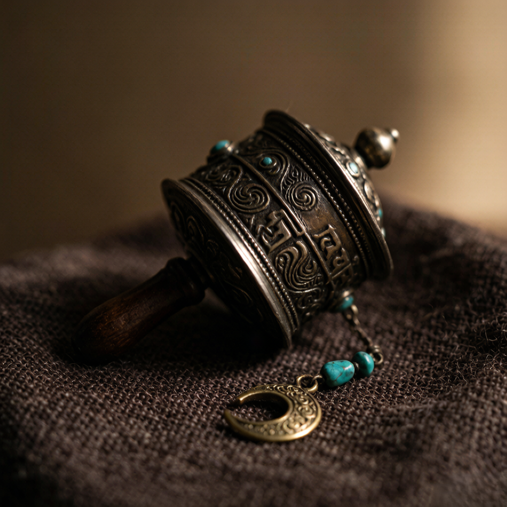
Translating landscape into wearable form requires restraint. We do not copy. We listen. When I knot oxblood red waxed cord beside saffron gold accents, I am thinking of cliff faces at sunset, of the moment warm light meets cold stone. The knot itself becomes the landscape — tight, layered, built one thread at a time.
Our Tibetan-inspired jewelry uses slow-made techniques because the colors demand it. A machine-woven band would flatten oxblood into generic burgundy. Hand knotting keeps the tone alive, letting slight variations in tension create shadow and depth across the surface. Each bracelet or charm carries the irregularity of real terrain.
Material choice matters too. Yak bone beads bring a matte, organic texture that echoes the plateau’s raw earth. Glass beads catch light the way high-altitude air does — crisp, clear, unfiltered. Brass details age like monastery metal, growing warmer with wear rather than colder.
Color placement follows a simple rule: the boldest hue leads, the neutral supports, the metallic accent surprises. An oxblood red band might carry a single saffron knot at its center, or an indigo base might reveal gold thread only at the closure. These small decisions turn a band of cord into a composition.
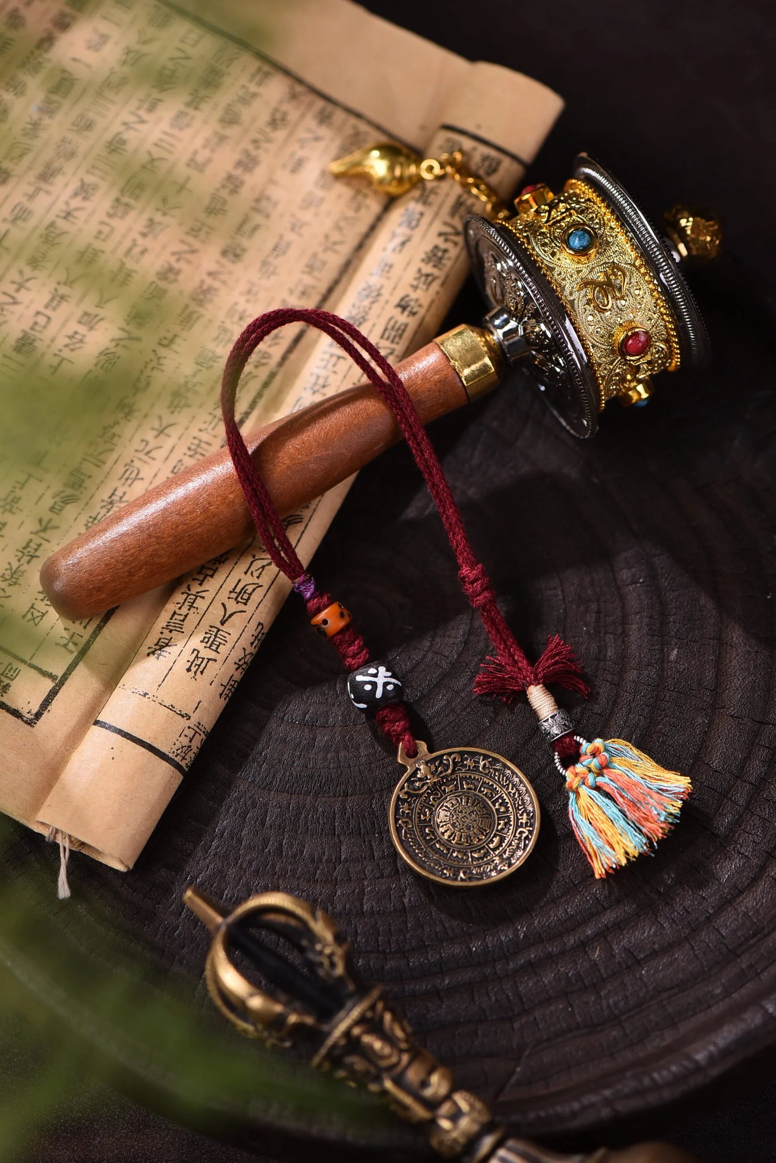
One of our most asked-about pieces is our oxblood-and-amber handwoven charm, built with yak bone and glass bead detail on knotted earth-tone cord. The palette came directly from a photograph of a mountain trail at dusk: red soil, grey stone, a single shaft of late light. We wove that moment into something you can wrap around your wrist or fasten to a bag strap.
Wearing Bold: Why Tibetan-Inspired Color Feels Different
Most nature-inspired palettes trend toward softness. Sage, sand, mist — lovely, but quiet. The plateau asks for more. Wearing oxblood red against pine green or saffron gold beside slate grey is a statement of presence. It says you are not trying to disappear into the background.
The surprising thing is how wearable these combinations become in daily life. Our customers tell us the same story: they bought a bold piece as an accent, then found it became their most-reached-for item. The colors do not clash with neutral wardrobes. They elevate them. A grey sweater becomes a frame. A white shirt becomes a canvas.
There is also the matter of texture. Bold color without texture reads as costume. Bold color in handwoven knotwork reads as lived-in, personal, earned. The waxed cord develops a patina. The brass darkens at contact points. The piece grows into your life rather than sitting on top of it.
Layering helps too. A single bold bracelet can feel like too much for someone new to saturated color. But stack two — one in oxblood, one in indigo — and they start to converse. Add a third in saffron gold, and you have built a wearable sunset. The key is letting each piece have enough space to be seen.
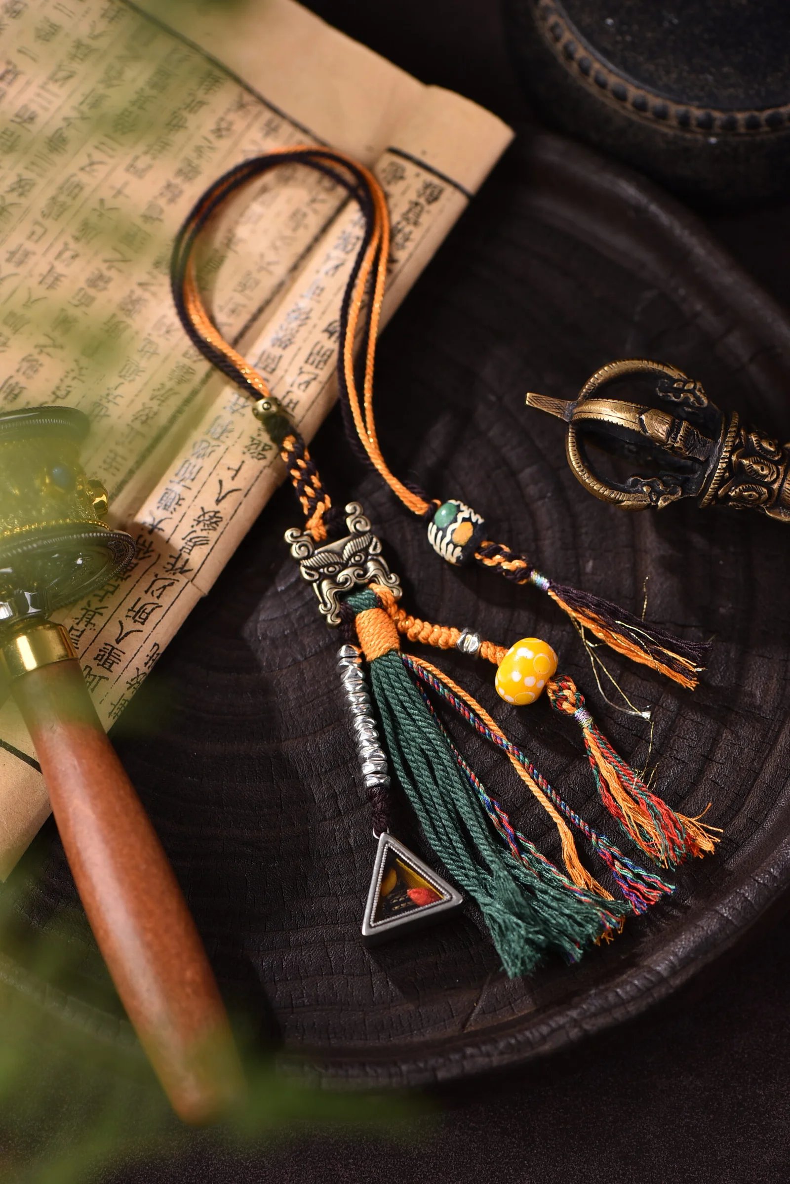
Another studio favorite is our brass-detailed earth-tone charm, handwoven with brass zhibaba and tsa tsa detail on warm brown cord. It carries the same saturated palette — oxblood, saffron, deep umber — in a compact form that layers easily with other pieces or stands alone.
Which Tibetan-Inspired Piece Is Yours?
Choosing a piece from this collection is less about matching an outfit and more about choosing a color story that resonates with your own landscape.
If you lean toward deep, grounded tones, look for oxblood red paired with charcoal or forest brown. These pieces anchor a look. They pair beautifully with denim, wool, dark linen — anything with texture of its own. Think of them as the visual equivalent of a bass note.
If you prefer warmth that catches light, saffron gold accents on cream or tan cord create a glow without shouting. They work especially well against olive, camel, or stone-colored layers. Wear them on days when you want to feel sunlit from the wrist outward.
If you want something that shifts with the day, indigo-based pieces change character under different light — reading as deep blue in sun, near-black in shade, violet at golden hour. They are the most versatile of the three palettes, and they pair with nearly every neutral you own.
All our Tibetan-inspired jewelry is knotted to order in our studio. No two pieces are identical because no two knots land with identical tension. That is the nature of handwoven work, and it is the reason these colors stay alive on the cord.
Browse the full handwoven jewelry collection to see current Tibetan-inspired pieces, or write to us about a custom palette drawn from your own travel photographs. We have woven colors from Patagonian glaciers, Rajasthani deserts, and Scottish Highlands. The plateau is simply where we started.
Nature, woven by hand. Color, woven into stories.
Want early access to new palettes and studio notes? Join our email list — no daily clutter, just color stories worth reading.
