 Skip to content
✨ New Year Offer: Up to 20% off ·
Begin 2026 with something handmade ✨
✨ New Year Offer: Up to 20% off ·
Begin 2026 with something handmade ✨

8 Color Palettes for Nature-Inspired Jewelry – TibetanTwist


Nature’s Color Notebook: 8 Palettes from Gardens and Skies — TibetanTwist
Some mornings the garden hands you a color you did not expect. A peony opens half its petals, and suddenly pink is not one shade but five — rose, blush, coral-edge, dust, and the deep plum where the shadow folds. We stand there with thread spools in our hands, trying to match what we see, and that is how every TibetanTwist piece begins: not with a trend board, but with a walk outside.
Here are eight palettes from our color notebook, each one borrowed from a garden, a sky, or a stretch of open ground — and woven, knot by knot, into handmade jewelry you can wear.
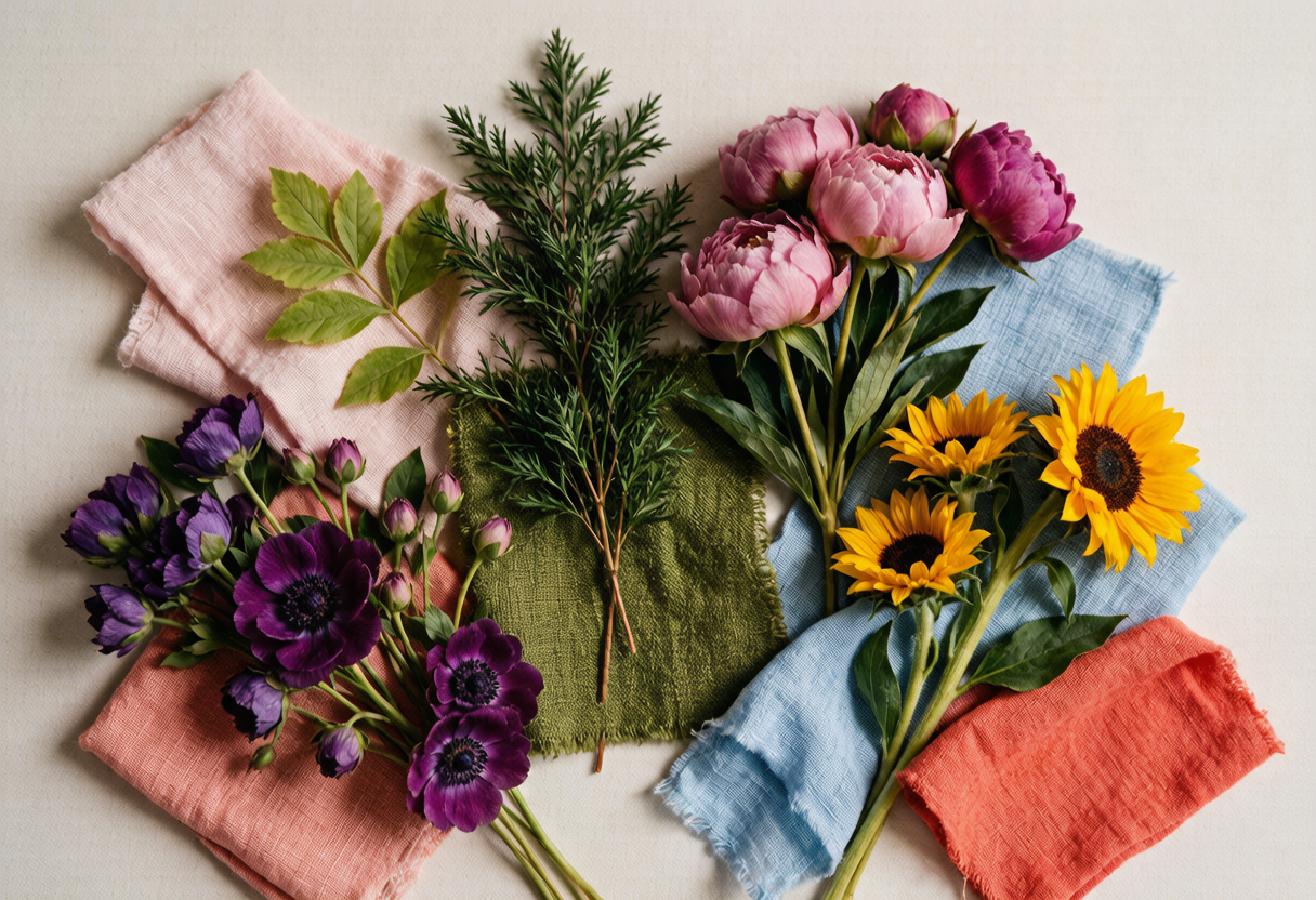
The Garden Shelf: Peony Pink, Moss Green, and Plum Purple
Three palettes live on the garden shelf of our notebook, and they argue with each other in the best way.
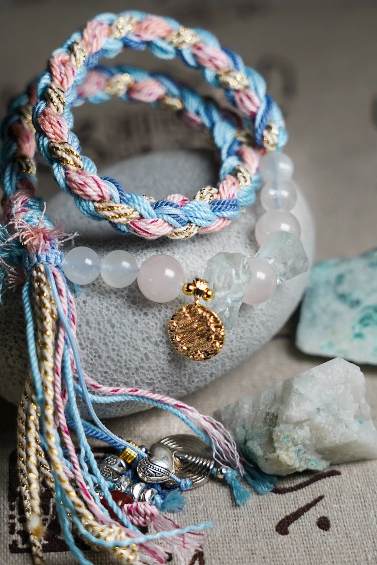
Peony pink is not the pink of candy or plastic. It is the pink of a flower that has been rained on — soft at the edges, deeper toward the center, almost red where the petal folds under its own weight. When we dye waxed cord to match, we hold the thread up against a real bloom and adjust until the hue sits right. Some days it takes three tries. The pink in our pink-and-blue handwoven bracelet was borrowed from a June peony that had just opened after a night of rain. We paired it with a sky blue — more on that in the next section — and the two colors have been talking to each other ever since.
Moss green is the color of patience. It is what happens when green decides to grow slowly — on the north side of a stone, on bark after a week of damp weather, on the linen cloth we leave draped over the garden basket. Moss green is never bright. It does not shout. It roots the piece the way moss roots a stone, and when we twist it with bark brown, the combination looks like a forest floor seen from above. Our green-and-brown handwoven bracelet wears this palette every day.
Plum purple arrives late in the season. It is the color of fruit just before it falls — heavy, round, almost black at the stem where the branch lets go. We use it sparingly, the way a garden uses it: as an accent, a period at the end of a sentence. Twisted into a cord with cream and soft grey, it becomes the kind of purple you notice on a second look, and by the third look you cannot stop seeing it.
The Sky Notebook: Monsoon Blue, Coral Sunset, and Storm Grey-Gold
If the garden gives us grounded colors, the sky gives us the ones that move.
Monsoon sky blue is the blue of a sky that cannot decide what it wants to do. It is not the cheerful blue of a summer postcard. It is deeper, heavier — the blue that arrives just before rain, when the air thickens and the light turns the color of wet slate. We weave it into our pieces as a single, confident stripe, and it changes the whole composition. Pair it with cream and the blue reads cooler. Pair it with plum and it turns almost indigo. It is the blue that says: something is about to happen.
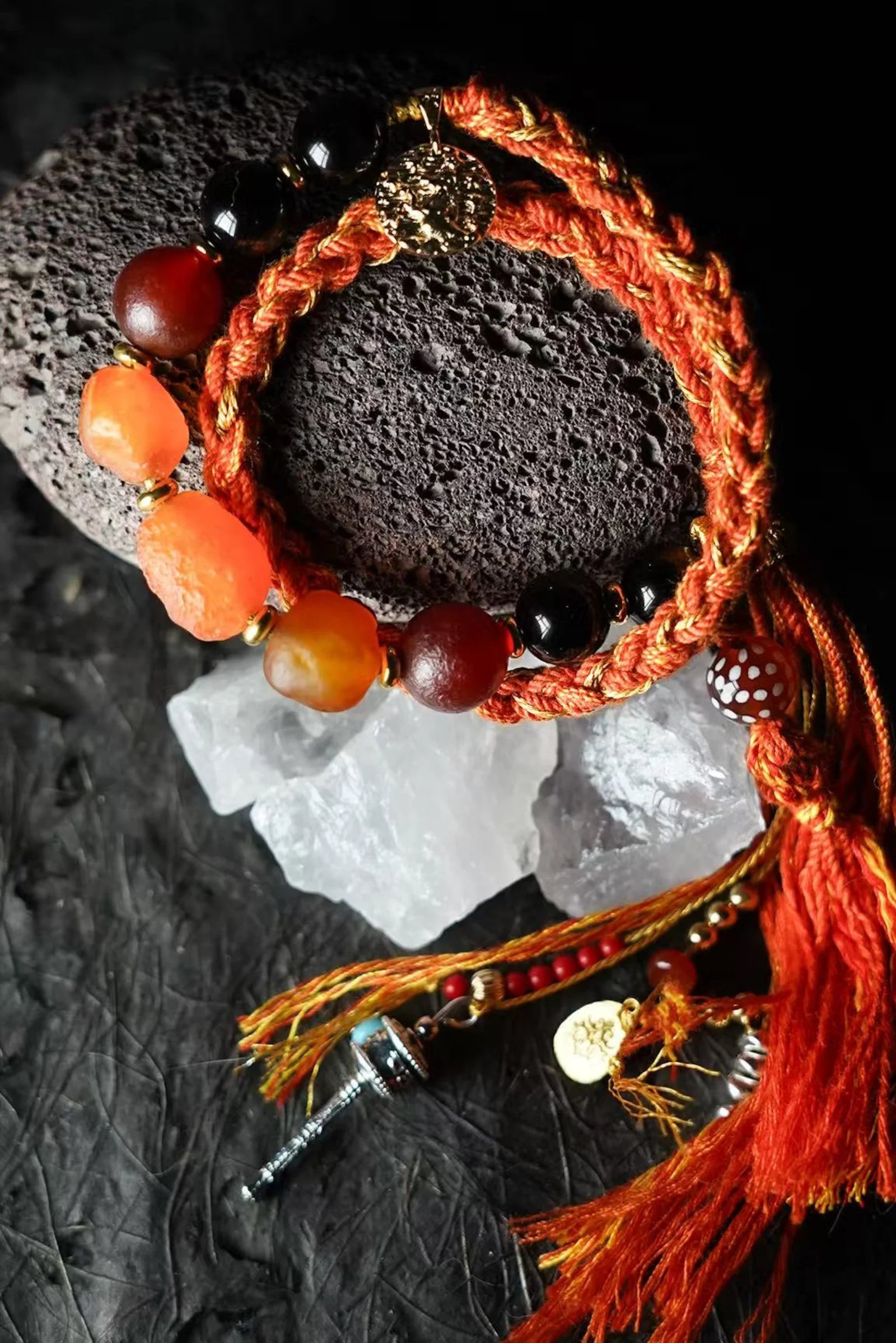
Coral sunset is what the sky does at the end of a long August day, when the horizon goes from peach to salmon to a deep, warm coral that has no name in any paint chart we have found. Our orange-and-gold handwoven bracelet borrows directly from this palette — the gold of low sun hitting the last cloud, the coral of the sky just before it goes dark.
Storm grey-gold is the most surprising palette in the notebook. It comes from the moment when a thunderhead catches the last light — the cloud is charcoal, almost black, but its edges burn gold where the sun cuts through. We replicate this by twisting a dark grey cord with a thin gold thread. The effect is quiet from a distance, then catches you when the light shifts. It is one of our most-requested combinations, and you can browse more pieces like it in our bracelets collection.
The Plateau Page: Oxblood Red and Saffron Gold
Two palettes in the notebook do not come from a garden or a sky. They come from the Tibetan plateau, where the air is thin and the colors have nowhere to hide.
Oxblood red is not crimson and it is not burgundy. It is the red of mineral earth — dense, dark, ancient. On the plateau, it appears in prayer flags snapped taut by wind, in coral beads worn smooth by decades of weather, in the paint on a temple door that has faced winter after winter. When we knot this red into waxed cord, it carries that weight. It is a red that does not ask for attention. It simply stays, the way a stone stays on a hillside.
Saffron gold is the color of the spice itself — not yellow, not orange, but a gold that sits exactly between the two and glows from within. On the plateau, monks dye their robes in this hue, and against the grey-brown landscape it looks like a small, steady fire. We use it the same way in our weaving: as a focal thread, a center stripe, the color that makes the surrounding knots make sense.
Together, oxblood and saffron are the most confident pairing in our notebook. They do not blend into each other — they stand side by side, the way a red prayer flag stands beside a gold one on a mountain pass, each one pulling the wind in its own direction. When we weave them into a single bracelet, the cord twists red, then gold, then red again, and the pattern never looks the same twice. That is the nature of handwoven work: no two knots land in exactly the same place.
Which Palette Is Yours?
Choosing a palette is not about matching your outfit. It is about matching a feeling — the particular mood of a garden, a sky, or a stretch of open ground that you carry with you.
If you are drawn to peony pink and sky blue, you are someone who notices the soft things. You stop for flowers. You let the weather in. You probably have a window you look out of more often than you realize.
If moss green and bark brown call to you, you prefer the colors that have been there all along. You do not need brightness to feel rooted. You understand that some of the best colors are the ones you stop noticing — until someone weaves them into a bracelet and puts them on your wrist.
If oxblood red and saffron gold catch your eye, you understand that some colors are bold because they have to be — because the landscape demands it, because the wind is strong and only the certain colors survive. You are not afraid of a color that takes up space.
And if monsoon sky blue is the one you cannot stop looking at, you are someone who waits for what comes next. The blue before the rain. The color of a sky about to speak.
Every piece in our bracelets collection is woven by hand, one knot at a time, in the colors we have collected from the world outside our studio door. Browse the full collection, find your palette, and wear a piece of the garden or the sky on your wrist.
Want a palette that is entirely your own? Subscribe to our newsletter for early access to new color stories, studio notes, and custom handwoven commissions.
Nature, woven by hand. Color, woven into stories.
